Part of the rendering series
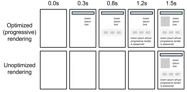
The definition of render blocking means to block the page from continuing to render. CSS is render blocking by default. Why is that? Browsers can't begin rendering a page until they’ve constructed the render tree. Browsers can't construct the render tree until they've constructed the CSSOM. They cannot construct the CSSOM until all stylesheets have arrived, been uncompressed, and parsed. CSS is therefore a bottleneck. Consider this:
- Every CSS file delays your page from loading
- The bigger the CSS file, the longer the page takes to load
How can we improve CSS loading?
CSS loading is defined as the manner in which CSS is used to render a page. It can be the loading of an external stylesheet, an internal stylesheet, or a combination of the two. What is the optimal loading scenario?
- No more than one external CSS stylesheet
- Scenario specific styles in their own stylesheet, referenced by "media" attribute
- CSS in the HTML head for immediately viewable content
- No @import calls for CSS
- No inline CSS in the HTML elements
No more than one external CSS stylesheet
Most projects only include one stylesheet. However, is that file optimized to lessen the impact on page speed? If every style for your site is included in a single stylesheet, incorporating all break points for responsive, all device specific styles for print or otherwise, or simply not minified/compressed, then it is not.
The rule of one external stylesheet may seem contradicted immediately when we begin discussing stylesheets specific to responsive break points or devices. But it really isn't. It may mean more work during development to separate the required information, but it's not impossible.
If your site CSS is around 2000 lines, including media queries, then perhaps a single CSS file is perfectly fine. However, if your CSS is upwards of 5000 or 6000 lines before compressing, it's likely time to begin optimizing. Optimization could be as simple as one stylesheet for tablet and desktop and a secondary for anything below "tablet dimensions". The stylesheets can both be listed in the HTML head and loading determined based on the media type attribute.
By defining media types and using media queries we are essentially marking some CSS resources as non-render blocking. The browser will download ALL referenced CSS, but will only load and render that which is explicitly defined for use.
A brief example of the media type attribute:
<link rel="stylesheet" media="all" href="styles.css">
<link rel="stylesheet" media="(min-width: 40em)" href="responsive.css">
<link rel="stylesheet" media="(orientation: portrait)" href="portrait.css">
CSS in the HTML <head>
Including "critical" styles within the head of your HTML markup reduces the number of calls to external resources, especially for those things that will be immediately presented to the end-user. This can have a big impact on load times; however, it's important to note, that CSS included in the head of your HTML is not cached by the browser like external CSS resources are. Depending on the project and need, including critical styles may make the most sense for home and landing pages – while external stylesheets may work best for the rest of the site, relying on browser caching, etc.
No @import calls within CSS
This rule is not only meant to avoid hidden additional references to external files. Rather, when including references to stylesheets in the head of your HTML, those files will be downloaded in parallel. Using @import will change that behavior and force the files to load sequentially – since one file is loaded, that in turn references another file to be loaded, etc.
Remove the calls for CSS using the @import method and include that CSS within the stylesheet that is making the call. Adding the additional, often minimal, CSS declarations to the main CSS file and removing the @import call will still improve load time.
Combine & Minify CSS
We've already discussed limiting the number of files loaded from external resources, but that isn’t always enough. We know that CSS is render blocking by default. So it would make sense to ensure that our CSS is the smallest and lightest as possible to improve page load.
The first step is to combine style declarations and rid our file of unnecessary cruft. Styles are added as needed throughout the development lifecycle. Take care when modifying styles to remove those that are no longer needed or even referenced.
The final step is to minify your CSS. This can be accomplished with a third-party tool, or as part of your compile process when publishing to staging. Note: minified code of any kind is meant for production environments and not used during development. Code should be kept as readable as possible during development.