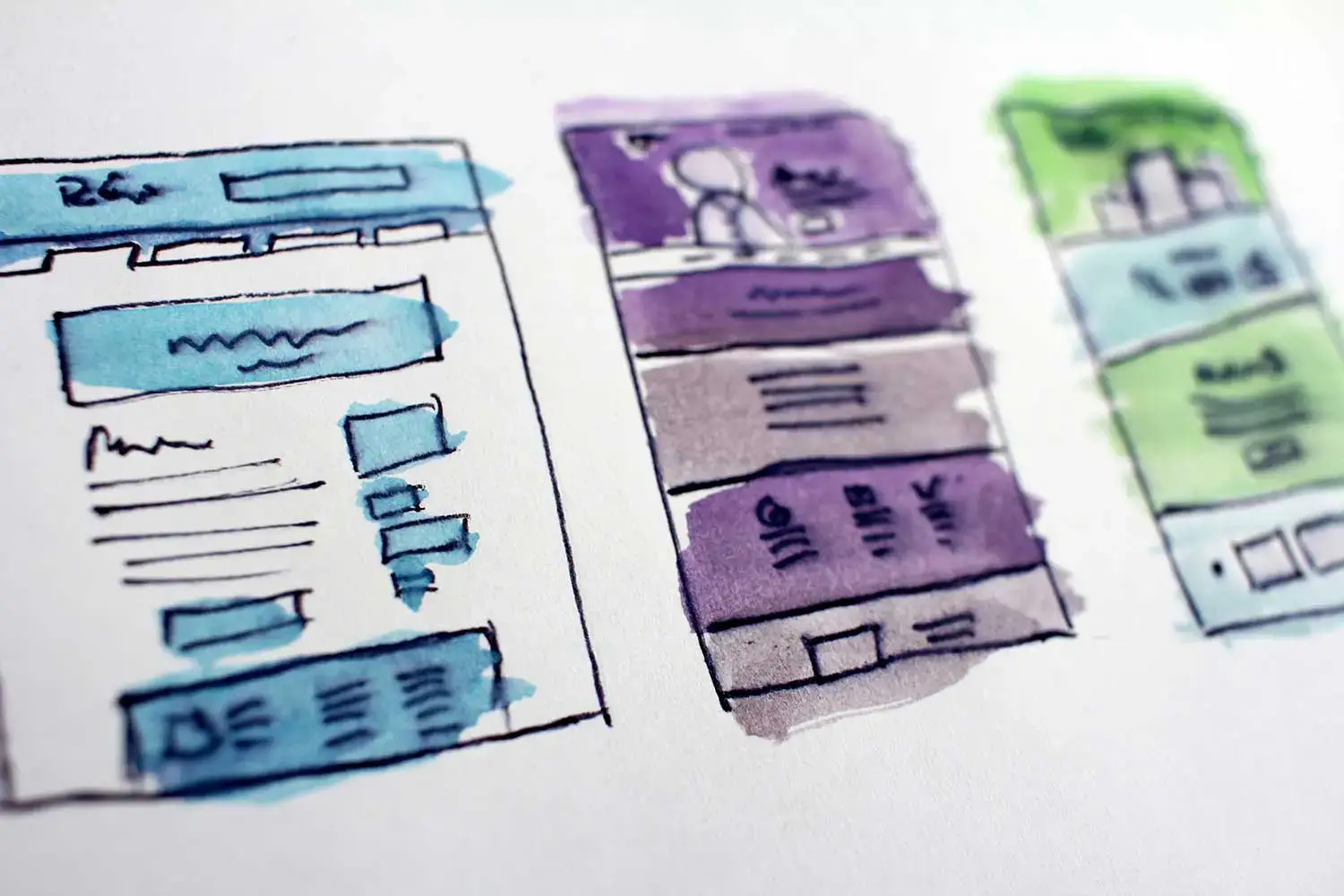
Responsive Web Development is neither "fluid" web design, nor is it "adaptive" web design. As a matter of fact, it's a little bit of both. In this article we will take a brief, but closer look at the concepts behind the basic types of website layouts. We will take a brief look at which has been the driving force of the past, and which is the way of the future.
There are four basic types of website layouts:
- Fixed
- Fluid
- Adaptive
- Responsive
Fixed Sites
A fixed layout has a single design that does not flow to fit any particular device width. It has set values for width, padding and margin and will always remain a constant regardless of how it is viewed. This has by far been one of the most commonly adopted website layout types.
When looking at common design/development techniques of fixed layouts, one of the first things that you will find is a common page width of 960px. Over the past decade, designers and developers have moved to a 960px grid because originally it not only met a common display dimension of popular screen sizes, but that the number is easily divisible into equal columns of 3, 4, 5, 6, 8, 10, 12 and 15.
While the 960px width has definitely served it's purpose, for it's time, modern devices and screen resolutions can sometimes enhance the limitations of the dimension. For instance, screens smaller than 960px width will display an unsightly horizontal scrollbar. Those screens that are much large than 960px width may display an unattractive amount of "white space" on both sides of the content. For these reasons, design and development have moved to more fluid, adaptive or responsive approaches.
Fluid Sites
A fluid layout is based on an initial design dimension but is not meant to be constrained to that dimension. A fluid layout has sizes that are specified in percentages rather than fixed pixels dimensions. The layout is developed in such a way that when the page resizes the content responds to fit the browser window fluidly; or if a different device is used, the layout will shift to accommodate.
Beyond sizing with percentages in mind, developers may also opt for using "ems" - those units of measure based on a square of the font-size being displayed (as opposed to a fixed pixel size).
Fluid Layouts derive their name from their result. Since the content is based on percentages relative to each parent element, as the screen is resized all content is allowed to scale fluidly with the container.
Adaptive Sites
An adaptive layout is referred to as such because the layout is not fluid, nor fixed. Rather, it adapts to the device that is viewing it. An adaptive layout can rely on code served up on the client side to detect the device and serve the correct content; however, this detection is more often handled by the server side code. Once the device is detected, the template, or layout, that most closely complies with the requisite dimensions will be served up to the client browser/device.
There has been debate over the true meaning of adaptive design for the past few years. The debate has primarily been focused on client side detection and adaptation using "progressive enhancement" versus server side detection and using modified templates as a starting point for each of the device types being targeted.
Client-side Detection and Adaptation
The concept is that the main template can be downloaded by the client browser. Then, based on the type of device, JavaScript will make additional requests to the server to deliver the content needed for the current viewing scenario. Once the base build is made, only those images, videos, etc required by the build will be downloaded and available to the user. Some refer to the additional calls to the server to deliver more content as progressive enhancement of the content that is being displayed. It can however, lead to unnecessary server calls and download time.
Server-side Detection
The concept may require different templates for each targeted device type. So perhaps a phone template, tablet template and desktop template - however, only if the differences between the content being rendered is great enough to require additional templates. When a user visits the subject website, the server detects the device trying to access the content. A custom template, if required, is delivered to the user's device. Only the content required by the template will be delivered. This content may also contain responsive or fluid traits built into the template.
More on this to come in a future post. Stay tuned!
Responsive
Responsive layouts are one of the most versatile layouts. A responsive layout can mimic a fluid layout because it is built on a fluid grid; however, it is also similar to adaptive design as it uses media queries to flow up to certain preset breakpoints where more drastic changes can be specified within the code. Pixel dimensions can be used, but ems and percentages may take precedence as these layouts typically have some fluid traits.
There is a misconception that all assets are downloaded whether they are needed or not. In some cases, this may be true. However, some of the download bloat can be avoided through specific CSS link media queries:
<link rel="stylesheet" type="text/css"
media="screen and (max-device-width: 480px)"
href="css/narrow.css" />
In the above we are querying the browser for it's maximum horizontal resolution. If it is less-than or equal-to 480px, then the browser is to download and incorporate the stylesheet. It is much more common to include @media queries within a single stylesheet; however, if load time is a concern, then a more "adaptive" approach, such as linking based on media may work better for you.
More on this to come in a future post. Stay tuned!


