Responsive web development is the method by which a developer makes a single website layout available across multiple devices regardless of the browser type or dimension.
Well that makes sense. We should all do that. Or, should we? Let's take a quick peek under the hood and then we can make an informed assessment based on our learnings at the end.
What is Responsive Web Development?
Responsive web development plays heavily on the expected outcome of the web designer. Must the content remain fixed to a set of rigorous defined dimensions, such as a 960px width grid, or should it flow freely in it's width to encompass the width of the browser? Can, or should, the content truly flow freely to the width of the browser, or should this only happen at predefined "break points"? Well, perhaps we should have the content adjust at predefined breakpoints and flow freely in between those breakpoints.
The Grid
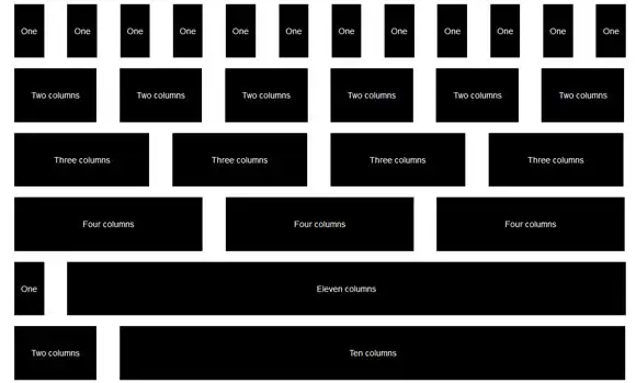
The grid is a design concept wherein a set dimension is used as the overall maximum width of the design "template". The dimension should be readily divisible into equal columns and allow for a common padding or margin to the left and right of each of the columns within the fixed space.

Common, predefined grid systems in use today, such as Bootstrap have styles included for almost any combination of column that may be used within their grid. To define your own grid (with the help of an online tool) check out GridPak. GridPak will output a PNG file that can be used in a Photoshop document to help designers create around the grid philosophy. It also outputs CSS (CSS, LESS and SCSS) and JS to help kickstart your development using the defined grid.
A Fluid Grid
Hold up! A fluid grid? Isn't that a bit contradictory? Well, frankly no.
Regardless of whether a site is being designed/developed for responsive or not, it should still be based upon a grid system. The difference being that when we are speaking of strict dimensions, such as a 1200px or 960px grid, we are literally speaking about pre-defined widths. Which precludes us from using these grids for a responsive design. Or does it? We still need to think about our design on a grid; however, instead of using defined pixel dimensions, for responsive we should use percentages. The percentages are based on the overall width of the client browser, regardless of device or dimension.
So using a percentage based grid will ensure that the site will look the same no matter the device? Not necessarily. Using the grid simply ensures that we are sticking to a defined base and maintaining order in some way.
A Static Grid
Can the uncertainty of flow and breakpoints be resolved by sticking to fixed widths? Would that resolve any issues that we may have regarding non-specific widths? Again, no. If we pre-define all of the widths based on pixel dimensions, then we will specifically be ignoring many different layout options.
The only way to try and achieve all layout options while using a grid system is to employ the power of the @media query.
Media Queries
A media query is a statement within a stylesheet that includes a media type and at least one expression by which the web browser can evaluate the relevancy of the statement and it's need. Media queries can be helpful in giving structure to a fluid grid/fluid design.
For example: in a fluid design, if you have 3 columns all set to be 33% of the overall width of the browser, these columns can be very wide - or very narrow - depending on the width of the browser's viewport. Using media queries, we can set a maximum browser width at which to stop the fluid nature of the columns to keep them from becoming too wide. We can also stack the three columns into a single column when the viewport becomes too narrow.
To truly emphasize the ability and magic of the media query, you should focus on the width conditions. Depending on the client's width you can either add specific styles or even load specific style sheets.
Support
CSS3 media queries are supported in all major browsers, and even in IE9 - even if to a limited degree. Check out this post for a complete breakdown of CSS3 Media Queries.
Breakpoints
Common resolutions or viewport widths can be defined in a system of major and minor breakpoints. A breakpoint is a dimension specified in your stylesheet that can force the styles to adhere to your media query rules.
Major Breakpoints
Major breakpoints are those dimensions at which a design is effected enough so as to force a change in layout. Perhaps involving a change in the number of columns being displayed. By columns I am referring to the columns actually displayed to the user; such as: left navigation, content and related items - in a 3-column layout. Not to be confused with the columns in a grid system - which should have less of an effect to what the user actually sees.
When using major breakpoints, 3-columns can become two by stacking content and again all into a single column by stacking everything.
Common major breakpoints:
- 480: first generation smartphones in portrait
- 768: high-end smartphones and iPad portrait
- 1024: landscape tablets or desktop
Minor Breakpoints
Minor breakpoints are those dimensions that are required in order to force adjustments that are not effected properly when dealing with fluid changes. These can be small changes to things like font-size or padding.
Common minor breakpoints:
- 320: low-res portrait smartphones
- 720: upper limit of smartphone portrait range
- 900: upper limit of tablet portrait range
Summary
So, it's best to use the described major and minor breakpoints from above when designing and developing my next website project?
You can if you want, but it's best to work with the needs of the content, keeping those breakpoints in mind. Start with the smallest screen first, resize the screen until the layout breaks (looks bad) then add a breakpoint. These breakpoints may or may not follow the sizes mentioned above, but chances are that you will add your own in close proximity to those described.
In the end, you need to base your development loosely on a fluid grid. Try and avoid using fixed pixel dimensions if you can - even when it comes to breakpoints. You can read more on customizing your media queries in my next article - CSS3 Media Queries.


